Thursday, August 19, 2010

Todays Obsession: Hearth, Kitchen Layout & Wooden Countertops

My Ideal, a naturalize kitchen.
My number one priority would be biodregradable material.
Second natural untreated materials such as rock.
Recycled, Reused, & Repurposed the better.

Only after I had done as much as I could with those two top prioties would I turn to manufactured products that are composed of recycled materials, and could be recycled theselves at a later date.

This is probably why Hearth Kitchens speak to me so deeply, they speak of a simple time when people lived, ate, and cooked from the earth and what was naturally available to them.


Seeing pictures like the one above just send shivers down my back, the raw wood beams, the massive fireplace, brick flooring to mark out the workings space! The only problem with traditional hearths is they always seem to be so confined and dark.


One detail I love with alot of old castle fireplaces is the inbuilt seating IN the fireplace! This let people get right up and personal around the fire, maximizing its use, and a great way to keep warm on a winter night! It's like when your cooking but for some reason the house is still freezing cold so you just inch your way as close to the stove as you can an warm your hands over the burners :P


I love how the kitchen from Whitmore Farms (Top Left) incorporates not only a fireplace, but the brick flooring, open wood beams, and raw wood table into a modern settling and style. Although the kitchen on the top right, featured in an article on Design*Sponge, has a little too much wood for my taste can you imagine an actual set of counters under that butcher countertop and a tile back splash?! However, I will admit it's perfect for its cottage setting. I love how this last (bottom) kitchen still has a hearthy feel and wooden beams, brick flooring, raw wood table, but has a brighter colour palatte that makes it easy to connect to the rest of the house.


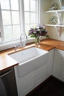
This next kitchen I love so many of its details! Although I'm one to be nervous of white kitchens I absolutely love their country tub sink and butcher block countertops! Cute decorative, yet functional, shelfs, and absolutely gorgeous, open, in-laid shelving! Just like a build in buffett and makes everything so easy to organize, access, & put away.

This basically sums u everything that's really important to me in a kitchen, the only problem left is layout and view as according to activity. When I'm cooking I don't mind facing a wall, but I hate having my back to people as their eating & talking; the chef should be part of the conversation too! On the other hand when your eating you naturally look for conversation pieces and things to look at, so why not an enclosed gazibo style alcove jutting out from the kitchen. The only problem I see though, is that I also want to see that same view while I'm doing dishes, no one wants their nose stuck in a corner while doing this chore, you want to be day dreaming, looking out over the back yard or fields and watching the kids play.  Which means my stove and sink would have to be in close proximity to each other on a wrap around counter or island, and I've yet to see such a setup that I actually like. I also admire open concept lay outs, and although I could never live in one that is truely open, I do like wide open doorways set up in such a way that you can look through them and into the living room should you wish.


(Left) An impromptu counter connects the kitchen, living room, and build in seating area through an open door way.
(Right) Creative Designs by Jean Courtney, Kitchen 7. The  6th picture in the series shows an absolute genius seating alcove, while the one featured here shows similar to what I would like.

My last detail... a half-cut old barn door leading outside to the garden from the side.

Sunday, August 15, 2010

Deconstruction of Commercial Food

When the movie SuperSize Me came out a couple years ago it caused an uproar. People were shocked, and disgusted, as to the effects that fastfood can have on the body and our health.

Now while each of us can make a conscious decision not to eat fast food, our local grocer is literally packed with mainstream commercially produced products. They're practically all that is made available to the general public (besides the over-priced niche organic products) which makes you think, what are these companies feeding us? What is our government allowing us to eat?

A Dwight Eschliman asked this question, and decided to share his findings in a very matter-of-fact manner, by photographing each ingredient that goes into the American Classic, the Twinkie. Grossly enough they all seem to look the same, like this:


37 Ingredients and they all manage to look like the two above (Glucose on the left, Sorbic Acid on the right) minus the occasional colourant. A quick look at the two ingredients above; Glucose is straight sugar, a by-product of the plant process photosynthesis its known to cause increased weight gain, and diabetes. Sorbic Acid is a naturally occurring acid found in unripe berries, used to prevent mold from showing up in the Twinkie and acting as a food preservative...yummy :S. Another ingredient that shouldn't surprise you, Animal Shortening; straight animal fat, and again meshing into this bland, unnutritional palate of ingredients.


The ingredients mentioned here are more or less naturally derived however, none of them are particularly nutritious, nor are they really that good for you in any other way. Keep in mind there are still another 34 ingredients, make sure to check them out at Dwight's own website for a full photo catalogue!

Get to know what you and your kids are eating!

Friday, August 13, 2010

Katie Turner & Cute Boys

I ran across a cute post over at Design*Sponge today (As I eagerly do every other day) that featured artist Katie Turner, and such featured illustrations.


Now, I'm not absolutely smitten by her art work but I did get a good chuckle out of this one piece and the amount of humour she's stacked behind it. But now newly single and starting to date again it got me thinking...is it really that wrong to have certain expectations going into a relationship? I always thought my friend Vicky was insane with her preconcieved notions of what her ideal man would be like...6 ft 3, good looking, worldly etc. I thought that to have such ideas would limit not only yourself and put unwarrented judgement on people but would also eliminate potential characteristics that might actually be compatible with you whether you know it/want it or not. So what would my 7 item list look like then? Probably something like this:

1. Funny
2. Down to Earth
3. Hippy
4. Spontaneous
5. Smart (enough to hold an intellectual conversation)
6. optimistic, hopeful, ambitious (all kind of tied together)
7. Masicistic

Three other criteria I'd love to not have to do without for an evenly rounded 10:

8. Reads
9. Enjoys Physical Outdoor Acitvites
10. Likes Seafood

Are you really limiting yourself if these are all qualities you value in a partner? In someone you'd potentially want to spend the rest of your life with?

What would your list look like?


Graduate Students Making a Difference fo Tomorrow

The future is never certain, but it is an exciting one, filled with possibility and in this case promise.

A New Zealand Exhibition running from August 2nd-15th featuring student exhibitions on sustainable design in every aspect. With just a couple days left I find myself wishing for a spare plane ticket to pop up in my couch cushions, however, next best is their online exhibits. A few of my favourites:

Ben McMahon- Bachelor in Industrial Design, Next Gen. Fan.

This one makes me jealous I didn't think of it first. An absolutely elegant design that takes full advantage of air movement to better distribute it throughout a room. You can just see it begging to be painted bright colours!


Olivier Vancaillie- Bachelor in Industrial Design, Next Gen. Windmill

Long gone are the days of those old wooden giants, Olivier presents his new idea of innovative form, similar to that of the fan above, that takes full advantage of wind flow from varying directions instead of the traditional one. Not only that but his design can be almost entirely made from recycled materials! (and I think there'd be less of an issue of birds flying into them!)


Edward Sackett- Bachelor of Industrial Design, contemporary jewlery.

Now lastly (because I can't talk about them all!) my personal favourite. Although it's not so much from an environmental perspective as the information provided on these rings was disappointingly little, not directly addressing HOW they are environmental; none the less, Edward came up witht he idea of imprinting a couple's fingure prints on these environmentaly friendly rings. May I shout "Pure Genius!" What an absolutely fantastic way to not only make the jewlery unique, but to contain so much emotion and connection in a single ring exchange! Why not take it one step further? As his design tends to avoid precious gems for the sake of staying environmental, I'd suggest looking into man-made diamonds in which a deceased can contribute!

Make Sure to Check Them Out!
http://www.srdchange.org/exhibits.html

Thursday, August 12, 2010

My Bathroom

It seems fitting to start this blog with something that sits close to home.
 
So this is my bathroom.
A project born out of a terrible end to an amazing relationship.
I needed something to bring me out of my horrible thoughts, something to look forward to...
So I redid my bathroom.
 
Before:

And the Toilet Corner:


I've been living in this apt for 2 years now and ontop of a failing relationship the wallpaper was starting to wear my patience thin. A dull green paint job made the space so much more stiffling and putting on makeup at any time besides noon in that dark, cramped room was made into a heroic effort.

So I:

Painted the room bright blue: $15
Painted the shelving white: $10
Switched around the toilet seat: $10
Got a new shower curtain: $10
New window dressing: Free (Made from material I already had)

Brushes & Such: $5

And Voila!

After:

 
For $50 I'm thrilled with how it came out, and it not only brightens the place up, and gives it a new look, but it gives me a new start. This is my literal clean slate and I love it!
 
I'm still waiting to get new fluffy white towels, and a new white floor rug, but all good things come with time. And my last little detailing will be in the toilet corner. When I manage to find time to pick up some spray paint (this is the result of wet paint, not so gorgeous) this stenciling pattern will cover the entire wall behind the toilet. Additional Cost- $5 for scrap book paper stencils from the dollar store.


Classic First Post!

Yesterday was my 20th Birthday.
Today I'm no longer a child.
Tomorrow I'll be one day closer to becoming a Globally Recognized Citizen.

You're either the person you are, or the person you want to be.
-Atreyu

And so, while each foot straddles the grey margin between what society deems me to be, I continue to explore who I am as a person, and find exhilaration in the world of design, architecture, and creativity; to find love and beauty in the world around me.


Jericho Ruins, dating back to 9,000 BCE. A tribute to design and construction.

This blog is for those moments; the moments of genuine inspiration in design that just make you go WOW! when you walk into a room, because it's the person's surroundings that display most explicitely how they are deciding to live, how they wish to be percieved. This is for everything design, from fashion, interiors, architecture, landscaping, weddings, right down to how we choose to design our lives.